
DiaVis: Exploration and Analysis of Diabetes through Visual Interactive System
- DOI
- 10.2991/hcis.k.211025.001How to use a DOI?
- Keywords
- Diabetes disease; visual analytics; visual interactive system; qualitative analysis; machine learning
- Abstract
Background: Diabetes is a long-term disease characterized by high blood sugar and has risen as a public health problem globally. Exploring and analyzing diabetes data is a timely concern because it may prompt a variety of serious illnesses, including stroke, kidney failure, heart attacks, etc. Several existing pieces of research have revealed that diabetes data, such as systolic blood pressure (SBP), diastolic blood pressure (DBP), weight, height, age, etc., can provide insightful information about patients diabetes states. However, very few studies have focused on visualizing diabetes mellitus (DM) insights to support healthcare administrator (HA)’s goals adequately, such as (i) decision-making, (ii) identifying and grouping associated factors, and (iii) analyzing large data effectively remains unexplored.
Objective: This study aims to design an interactive Visualization system (Vis) to explore diabetes mellitus (DM) insights and its associated factors in Bangladesh.
Methods: In this study, first, a case study method has employed to understand diabetes data. Second, we examine the potential of user-centered technology in addressing these challenges and design a Vis named “DiaVis” to process and present raw data in the form of graphics, graphs, and processed text, as well as a variety of user interaction possibilities. It helps to extract valuable data and present it in a simple and easy-to-understand way. Moreover, we highlight some key insights from our study that may help explore the healthcare community.
Results: A user study with 20 individuals is used to evaluate our system. By allowing iterative exploration and modification of data in a dashboard with multiple-coordinated views, the DiaVis system improves the flow of visual analysis.
Conclusion: This study suggests that the healthcare community should pay more attention to developing appropriate policy measures to reduce the risk of DM.
- Copyright
- © 2021 The Authors. Publishing services by Atlantis Press International B.V.
- Open Access
- This is an open access article distributed under the CC BY-NC 4.0 license (http://creativecommons.org/licenses/by-nc/4.0/).
1. INTRODUCTION
Diabetes mellitus is a hormonal and metabolic disorder in which the body can not produce enough insulin and increase blood sugar level abnormally high. As a result, diabetes damages the nerves, raising the risk of chronic kidney disease, stroke, heart attack, eyesight loss, and so on [34]. Diabetes mellitus is a syndrome that is now recognized and classed as a disease defined by signs and symptoms of chronic hyperglycemia. The number of diabetes patients is increasing day by day, where 1.6 million people were died due to diabetes [6]. According to the statistics, it has been stated that about 122 million people affected by diabetes in 1980, with the rate increasing to 422 million in 2014 [12]. Furthermore, the estimation will be struck to 642 million approximately in 2040 [49]. Over the last 20 years, the number of patients significantly affected by type 2 diabetes, approximately 90%. This increasing rate is very much alarming for the future. In response, there is a growing need for identifying diabetes disease and the significant factors that have a substantial impact on diabetes. Moreover, delays in diagnosis are an important contributory factor to poor control and risk of complications.
The signs or symptoms of diabetes are increased hunger, frequent urination, increased thirst, tired/sleepiness, weight loss, blurred vision, etc. This disease considers three types such as type 1, type 2, and gestational. Type 1 can develop at any age when insulin-producing cells are attacked by our immune system [15]. Type 2 is the most common in adults. According to the current American Heart Association Heart Disease and Stroke Statistics, type 2 diabetes affects around 8 million persons in the United States aged 18 and above. In that case, a healthy diet and lifestyle is the way of being well [8]. Nevertheless, gestational diabetes occurs during pregnancy among 2–10% pregnant women, and most of the cases are cured after pregnancy [25]. As diabetes is becoming more prevalent and the nature of diabetes data is nonlinear, non-normal, correlation structured, and complex. So, it is the quite challenging task of analyzing diabetes [30]. Even then, several researchers attempted to forecast diabetes disease using a variety of approaches.
However, traditional approaches are limited in their ability to consider such a large amount of data, where advanced technology such as visual analytics [18] provides the insightful impact to predict diabetes disease as well as identify the most significant factors. For example, Bhardwaj and Baliyan [7] visualized diabetics data in different ways and also proposed an interactive visualization system using Tableau. They explored how people are affected by diabetes of all ages. Luboschik et al. [28] explored three visualization techniques TTPC-Table Lens, SPL-OM and Matrix view enhanced, and Parallel Coordinates which improved the early detection of diabetic neuropathy. However, very few are adopted visualization techniques to predict diabetes disease. Most of the researchers preferred machine learning or a deep learning-based approach rather than visualizing the system. For example, Wong et al. [44] use the Tidepool platform where the patient can view their glucose meter, insulin pump, and CGM data. Maniruzzaman et al. [33] utilized four classifiers and logistic regression (LR) models as the most risk identify factors. With the combination of LR-based features and RF-based classifiers, their model achieved 94.25% accuracy. Although a lot of research is being done to identify diabetes using increasingly advanced technologies, we’re also looking into an advanced technique that proposes an interactive visualization dashboard to highlight the right direction for determining the critical factors in diabetes. Although many researchers conducted their study in various countries, we have demonstrated our analysis in Bangladesh, which has the most significant impact on the healthcare system. Thus, this research is essential as it enables detecting diabetes at early ages and considerable risk factors.
Diabetes has unquestionably been a severe threat in Bangladesh, where a vast portion of the population is oblivious to the detrimental effect of diabetes and the risk factors. Therefore, we proposed an interactive visual system (Vis) for exploring diabetes disease named DiaVis to address the limitations mentioned above as shown in Figure 1. The goal of using the visualization technique is to give a more comprehensive solution, to assist end-users in analyzing diabetes conditions, as well as to identify the key factors which are significantly involved with diabetes disease in Bangladesh. With that aim, first, we employed a case study model to understand the factors that affect the diabetes disease as shown in Figure 2. By observing the increasing rate of diabetes patients and previous research of diabetes disease, we were motivated to propose DiaVis that can represent the significant diabetes factors. DiaVis represents multiple relations with diabetes such as height-weight relation, age, SBP, DBP, region, smoking status, etc. Moreover, DiaVis will help to identify the most significant and high impacting factors of diagnosing diabetes disease. Thus, we look to achieve the following research objectives:
- •
Understanding current practices and analyzing the effects of height and weight in the context of diabetes disease.
- •
Identifying the implication of SBP and DBP when observing diabetes disease.
- •
To determine the analytical result of smoking status, age, working status when dealing with the various region.
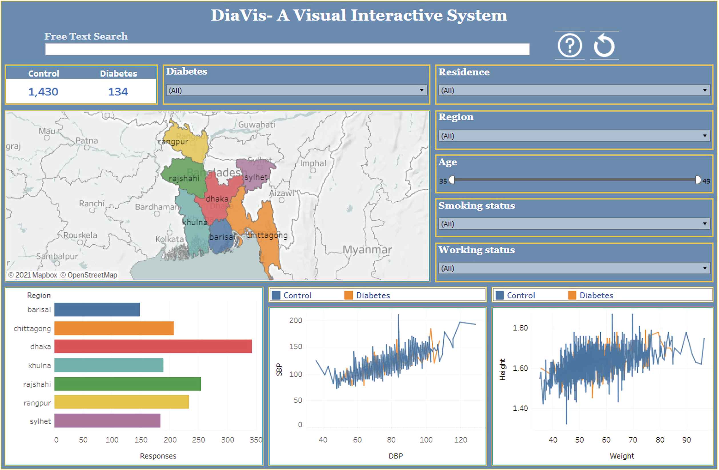
A visual interactive system for exploring diabetes disease in Bangladesh.
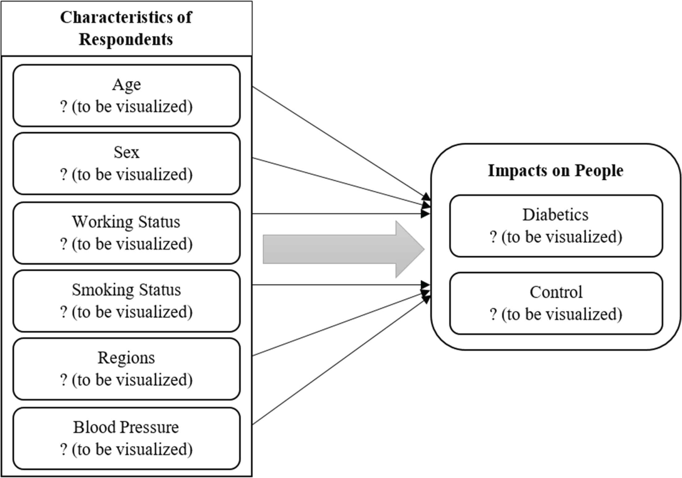
Conceptual illustration of the study.
Visual interactive systems (Vis) are widely used for different purposes such as recommendation systems, mental health analysis, disease analysis, sentiment analysis, etc. [21,23,47]. Visualizing diabetes data [43], Hadoop based analysis and visualization of diabetes [7], were emerged to provide a visual overview of diabetic disease analysis. However, their contribution focused on structured data, whereas our implementation provides an interactive and effective dashboard that flourish more insights regarding diabetes disease. In this research, we propose an advanced visualization system to analyze diabetes disease. In turn, we uphold the significant features which primarily affect the analysis.
The following is the outline for this paper: in Section 2, we provide the background study of this research. We present the design methodology in Section 3. In Section 4, we briefly explain the visualization findings to evaluate the performance and consider the possibilities for more and related research. We perform a user study in Section 5, and in Section 6, we briefly discussed some key insights according to our system. Finally, in Section 7, we provide a conclusion.
2. BACKGROUND STUDY
This section provides brief literature on diabetes disease by exploring several analyzing techniques. Additionally, the existing approaches have been reviewed in several aspects, with a complete comparison at the end of this section.
2.1. Exploration of Diabetes Disease
Many researchers worldwide have been working on using various techniques to predict and forecast and analyze diabetes disease in recent years. For example, to classify diabetes data, Christobel Y. A. et al. [11] applied a new class-wise K-Nearest Neighbor (CKNN) classification technique and found that it outperforms simple KNN in terms of accuracy, sensitivity, and specificity. Lee et al. [27] predicted fasting plasma glucose which has been used to diagnose diabetes disease. They compared Naive Bayes (NB) and logistic regression (LR) to determine which technique provides the best accuracy, wherever NB delivers the best accuracy than LR. Additionally, Dey et al. [14] suggested an architecture based on the higher prediction accuracy of a sophisticated machine learning algorithm to determine whether a patient has diabetes or not. According to their analysis, artificial neural networks (ANN) provide the most significant accuracy. Wang et al. [42] established an effective prediction tool, especially for type-2 diabetes mellitus (T2DM), and investigated the possibility of genetic risk scores (GRS) in rural adults using multiple classifiers. They combined with GRS, which provides incremental performance for T2DM.
A noteworthy research work has been conducted which discusses the summarization of several chronic diseases using machine learning techniques which include diabetes disease also [17]. Sarwar et al. [40] performed a predictive analysis and revealed which algorithm is best suited for predicting diabetes disease. They proved that SVM and KNN provide the highest accuracy for predicting diabetes. From the research mentioned above works, it has been identified that existing studies covered various advanced technologies to determine whether diabetes or not. Most researchers preferred DL or ML techniques, and very few have explored visual analytic techniques to assess diabetes disease.
2.2. Visual Analytics for Exploration
In this section, we review previous studies that inspired examples to develop new technologies and prominently flourished this sector. However, several recent studies focused on visualization techniques for exploring the field of healthcare analytics. For example, Kwon et al. [26] proposed a visualization system DPVis to explore disease progression patterns and to derive clinical insights. They conducted a design study with clinical scientists, statisticians, and visualization experts to look into chronic disease pathways, namely, type 1 diabetes.
Swaminathan et al. [41] explored the ontology visualization tools, assessed them to see if each method was appropriate for end-user applications. In their research work, ontologies are used for the case of diabetes diseases. Wong et al. [44] described the usability and feasibility of software application in clinical practice and utilized diabetes data as a baseline. They test the usability of diabetes data especially type 1 diabetes (T1D). Bhardwaj et al. [7] performed Hadoop-based analysis to visualize diabetes data using Tableau software. They explored diabetes case studies and proposed a comparison among Pig, Hive, and Tableau.
Visual analytics is used by Mahan et al. [29] employing to assess and comprehend the prevalence and impact of diabetes worldwide and in the United States. Their research identifies countries with a higher risk of diabetes, particularly in the United States, where early detection and prevention can save lives and reduce medical costs. Furthermore, Röhlig et al. [37] presented a user interface that incorporates numerous VA tools, considerably boosting the practical value of our VA approach for detecting diabetic neuropathy by unifying access to their free exploration of medical diagnosis. The most common long-term complication is diabetic neuropathy; they try to minimize the risks and emphasize the need to detect nerve fiber abnormalities as soon as feasible.
There are many challenges to providing an interactive visualization system, especially for the healthcare sector [18,19]. More recently, Rind et al. [35] discussed that poor data quality and ambiguity are among the challenges in building visual analytics tools for temporal electronic health records. Furthermore, Zhang et al. [48] designed and implemented an interactive visualization tool titled as IDMVis to support clinicians adjusting intensive diabetes management treatment plans and categorize the process when making diabetes treatment decisions.
3. MATERIALS AND METHODS
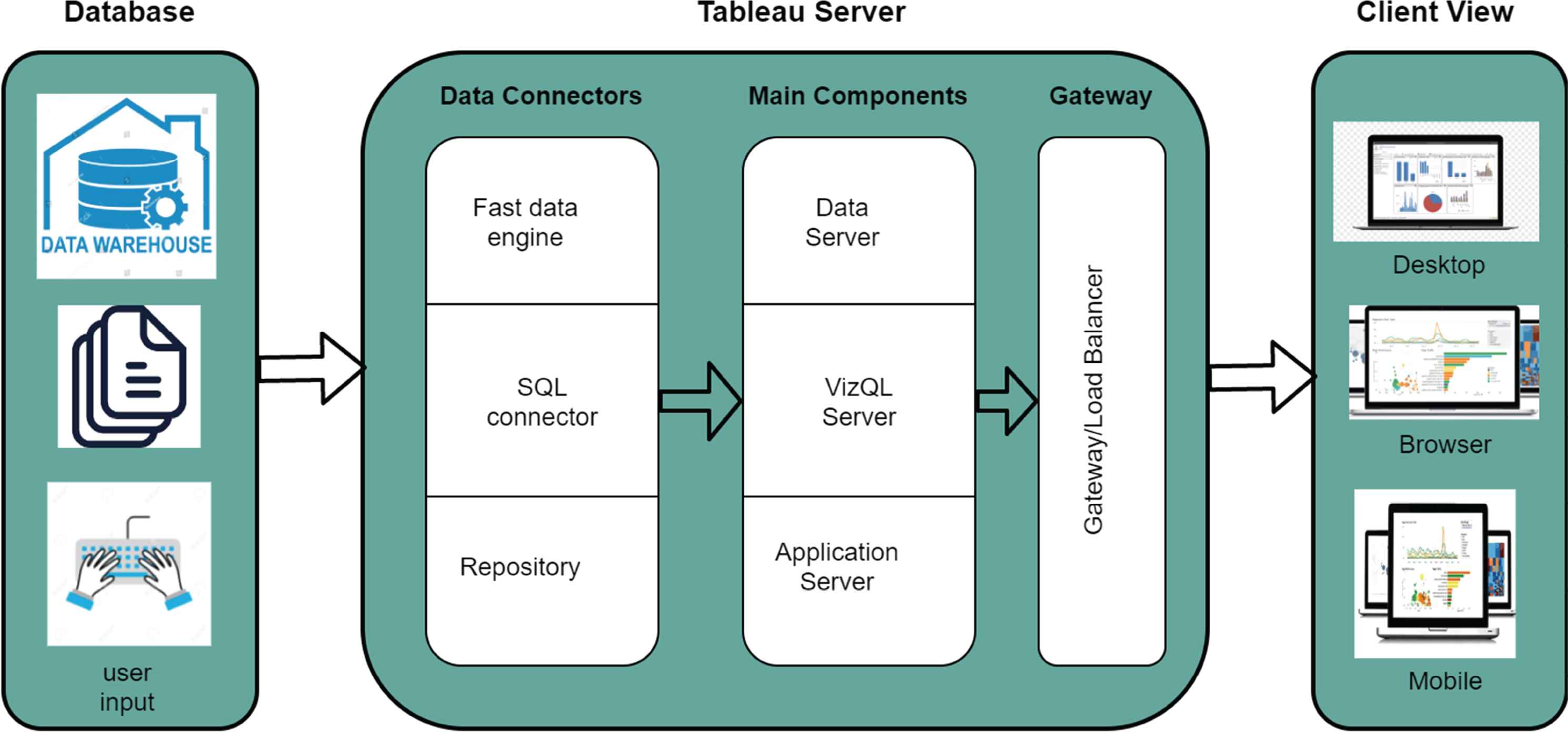
This section explains how DiaVis can be used as a custom dashboard for finding, designing, showcasing, and deploying applications. In addition, information on data collection and processing is included in the section for representations of practical consequences of the design.
3.1. Research Design
Qualitative research is the process of discovering the truth, finding a solution, and gaining knowledge. Qualitative research is usually made up of conceptual ideas and convictions that are used to investigate a specific topic [13,46].
In comparison to policy reports and books, the case study method is brief, descriptive, and popular. For a deep, extensive, and intense analysis, the case study method is applied. Furthermore, the case study approach is ideal when the researcher has perfect cases to investigate and provide a thorough comprehension of the phenomenon [45].
Additionally, the prevalence of DM and its associated factors were used as a unit of analysis to determine the socio-demographic determinants that influence diabetes mellitus prevalence in Bangladesh.
3.2. Data Collection and Processing
In this study, we used the publicly available data where there were 1564 individuals people with nominal and ordinal variables [31]. From the dataset, we observed that two patients have zero cm of arm circumference, three patients have zero systolic blood pressure, two patients have zero diastolic blood pressure, and two patients have zero kg of weight in this dataset. It is noted that missing or null values are used to indicate zero values. Thus, in the data preprocessing phase, we must remove the null values. As a result, we have 1555 individuals’ data in our final dataset, where there are 132 diabetes patients and 1423 healthy controls in the sample. Table 1 shows the statistical overview as well as the attribute descriptions are shown in Table 2.
| Characteristics | Count of responses | % |
|---|---|---|
| Sex | ||
| Male | 1,560 | 99.74 |
| Female | 4 | 0.26 |
| Age (years) | ||
| Median age (range) = 43 (35–49) | ||
| 35–39 | 520 | 33.24 |
| 40–44 | 506 | 32.35 |
| 45–49 | 538 | 34.39 |
| Region | ||
| Dhaka | 343 | 21.93 |
| Chittagong | 208 | 13.30 |
| Khulna | 190 | 12.15 |
| Barishal | 149 | 9.53 |
| Rajshahi | 255 | 16.30 |
| Rangpur | 234 | 14.96 |
| Sylhet | 185 | 11.83 |
| Working conditions | ||
| Yes | 1,549 | 99.04 |
| No | 15 | 0.96 |
| Smoking conditions | ||
| Yes | 248 | 15.86 |
| No | 1,316 | 84.14 |
| Blood pressure SBP (Minimum = 72, Maximum = 210) | ||
| 72–112 | 729 | 48.39 |
| 113–163 | 144 | 50.57 |
| 164–210 | 16 | 1.02 |
| Blood pressure DBP (Minimum = 36, Maximum = 129) | ||
| 36–86 | 1,282 | 81.96 |
| 87–129 | 282 | 18.03 |
| Weight (KG) (Minimum = 35.4, Maximum = 96.5) | ||
| 35.4–50.9 | 540 | 35.26 |
| 51–65.9 | 746 | 48.71 |
| 66–80.9 | 214 | 13.97 |
| 81–97.5 | 31 | 2.02 |
| Diabetes | 134 | 8.57 |
| Control | 1,430 | 91.43 |
Characteristics of respondents
| Attribute | Type | Description |
|---|---|---|
| Age | Number | Age in years |
| Residence | String | Rural or Urban |
| Region | String | Different areas |
| Working status | Boolean (yes/no) | Whether any of them is unemployed |
| Smoking status | Boolean (yes/no) | whether any of them is non smoker |
| Systolic blood pressure (SBP) | Number | SBP in numbers |
| Diastolic blood pressure (DBP) | Number | DBP in numbers |
| Height | Decimal | Height in decimal numbers |
| Weight | Decimal | Weight in decimal numbers |
| Class | String (diabetic or control) | Whether the objective identified as diabetic or normal |
Diabetes dataset description
3.3. Conceptual Model for the Study
Table 1 showing the percentage of the Sex: 73.74% male, 0.26% female, Age: 33.24% (35–39), 32.35% (40–44), 34.39% (45–49), Region: 21.93% Dhaka, 13.30% Chittagong, 12.15% Khulna, 9.53% Barishal, 16.30% Rajshahi, 14.96% Rangpur, 11.83% Sylhet, Working Conditions: 99.04% Yes, 0.96% No, Smoking Conditions: 15.86% Yes, 84.14% No, SBP: 48.39% (72–112), 50.57% (113–163), 1.02% (164–210), DBP: 81.96% (36–86), 18.03% (87–129), Weight: 35.26% (35.4–50.9), 48.71% (51–65.9), 13.97% (66–80.9), 2.02% (81–97.5), Diabetes: 8.57%, and Control: 91.43%.
Figure 2 illustrates the conceptual model of this study. This model shows various conditions for diabetics, which we explored in detail, that are most potent and have impacts on people’s health and affect people’s finances.
3.4. Requirements and System Design
We need to understand the typical decision-making process inside a clinical routine to create an effective visualization system for investigating diabetes. Also, we need to know what kinds of information concerning the decision problem are available and how humans process these data elements. Clinical decisions are based on clinical guidelines as well as the physicians’ knowledge and experience. Height, weight, SBP, DBP, gender, smoking status, job status, and age are all considered in the guidelines. These data come from various places, and they’re often unstructured and unsorted in terms of their relevance to the decision. Thus, based on our expertise and in light of newly stated design and functional requirements for DiaVis, our approach includes the following representations:
R1: The visualization system makes it easier to assist decision-making regarding diabetes of a patient.
R2: Multiple coordinated views present more effortless and understandable data to identify diabetes patients and control patients based on different criteria.
R3: The mapping and region view is added to describe the number of diabetes patients in a region.
R4: Users must know the association between systolic blood pressure and diastolic blood pressure.
R5: Users require to understand the relationship between the height and weight of a person.
Figure 3 illustrates the methodological framework of DiaVis. It is designed to guide healthcare administrators (HA) in exploring the diabetes conditions of people. According to Islam et al. [20], the following four steps of the design architecture are: 1) Discover: First, we discover the problems, challenges, and requirements. 2) Design: After finalizing our understanding of exploring diabetes conditions of people, we explored the design space of qualitative analysis with multiple coordinated visualizations. 3) Implement: We developed a new dashboard named “DiaVis”, where HA could effectively compare diabetes condition data between different age, region, blood pressure, and occupational people groups. 4) Deploy: By analyzing several case studies and corresponding refinements, we deployed our DiaVis system as a tool.
The methodological framework of DiaVis.
4. VISUAL APPROACH TO EXPLORE AND ANALYSE OF DIABETES
In this section, we provide the design and implementation of DiaVis - an interactive visual system to assist the users in understanding, engaging, and investigating the system thoroughly. Figure 1 shows how our system serves the user to interpret the diabetes dataset using a dashboard. The interface of our system contains the search box, the regional map, and the other attributes of our dataset. Users can provide input to the dashboard using a keyboard or a mouse. From this figure, we can observe the number of diabetes cases in Bangladesh in the dashboard. Our final dataset has 1564 patient information, where only 134 people are diabetes patients, and the number of control patients is 1430.
There are several inputs in our system. To visualize the number of diabetes cases, users can select their input choice according to the significant factors, including residence, region, age, smoking status, and working status. Moreover, the interface of our system produces four interrelated views: the mapping view, the region view, Correlation Between SBP and DBP and Correlation Between Height and Weight are shown in Figures 4–7 respectively. We can observe the difference in our results through these views by changing the above-stated inputs. The details of these views are discussed in the following sub-sections:
Mapping view of respondents.
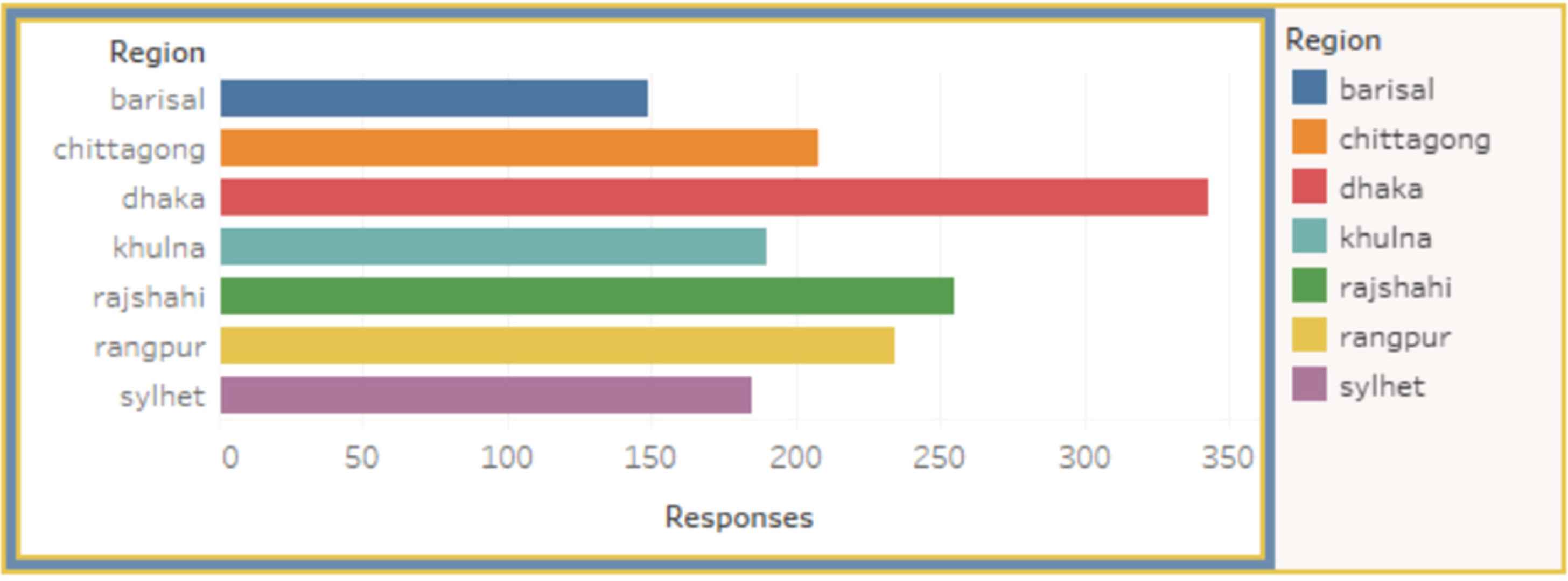
Regional view of respondents.
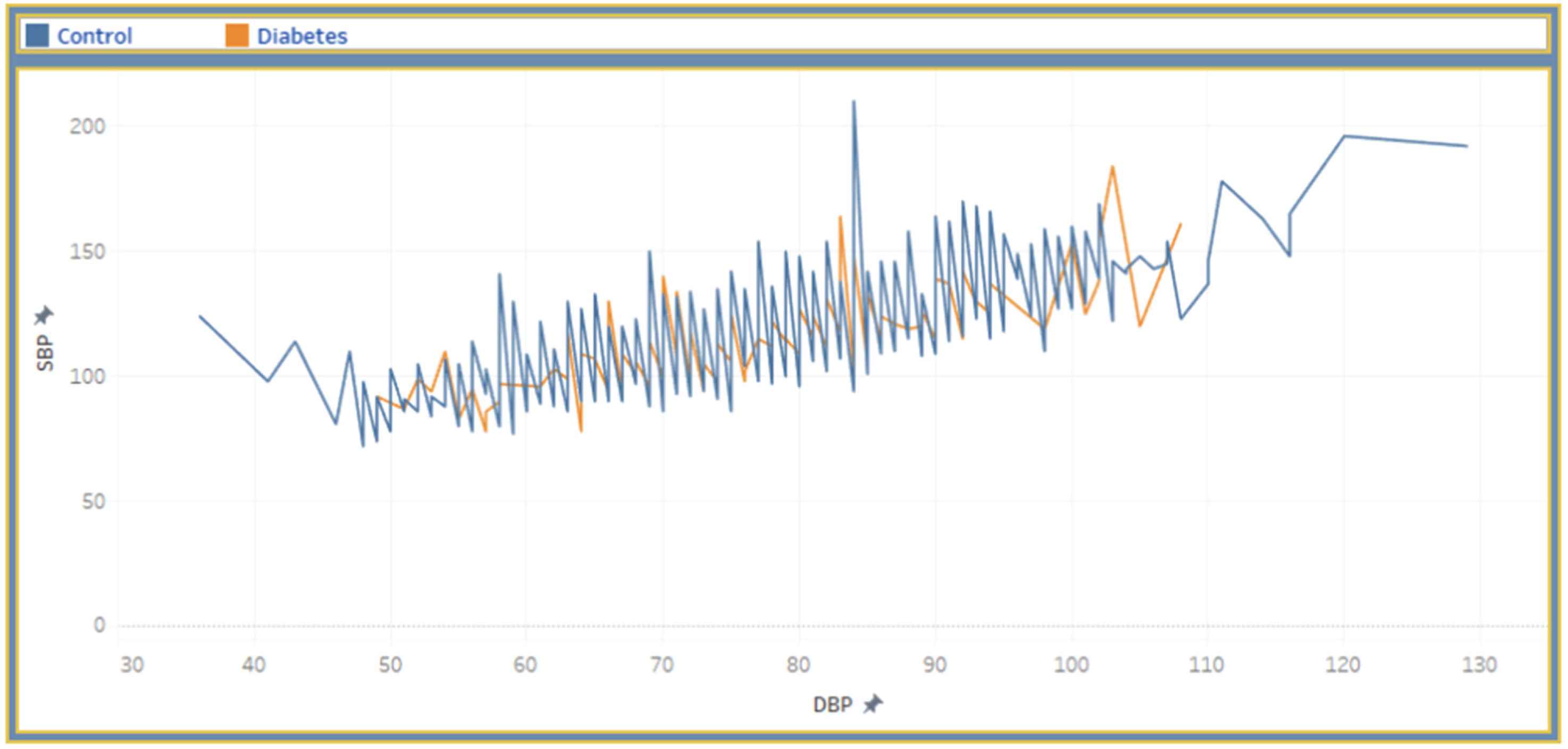
Correlation between SBP and DBP.
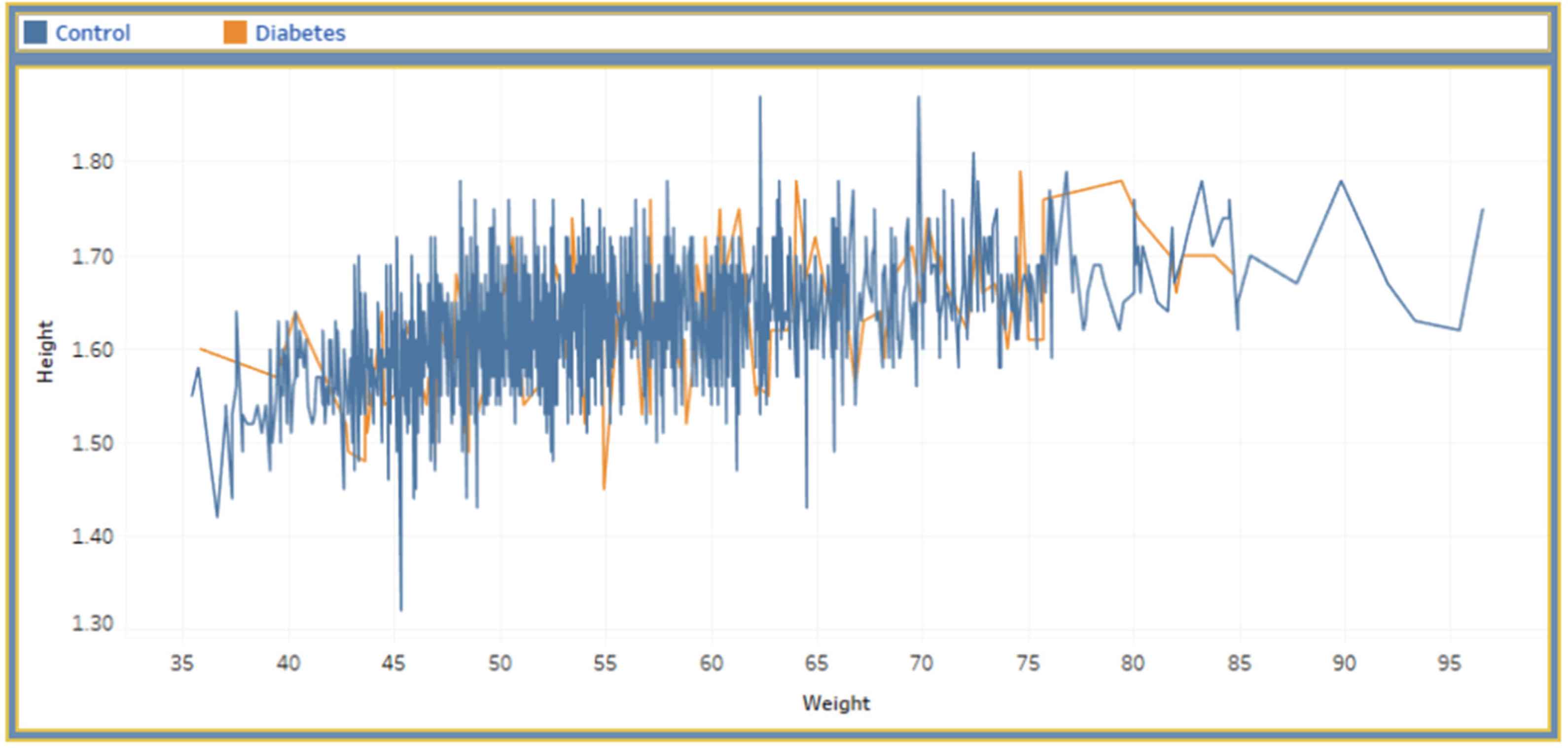
Correlation between height and weight.
4.1. Free Text Search
Free text search has recently sparked a surge of attention in data visualization studies [10]. It responds to user requests by either developing a new visualization or incorporating an existing visualization into an existing visualization dashboard. We built a ‘free text search’ parameter and a ‘free text filter’ calculated field that referenced that parameter in this research, which looked like this: CONTAINS (LOWER ([field name]), LOWER([field name])). The system under this method searches the field name in the dashboard first and then displays the visual result. For example, given the query, select single region type: ‘Dhaka’ or ‘Rajshahi’, to select particular residence type: ‘urban’ or ‘rural’, to choose particular case type: ‘diabetes’ or ‘control,’ etc. According to the search query, the system will provide the result from the data table and initiate an impact in the dashboard.
4.2. Multiple Coordinated Views
Multiple Coordinated Views (MCVs) is an experimental visualization strategy that allows users to look at their data in a variety of ways [36]. The goal is to identify information in many possibly different datasets with a diversity of components and types and make sense of them. We focus on how our system permits selection within various dashboard displays and uses frame-based query actions to generate the answer in this manner. For example, do you want to find how many participants have diabetes according to their age and region?. So, our system will first see how many diabetes patients are there at a specific age and also find out their part.
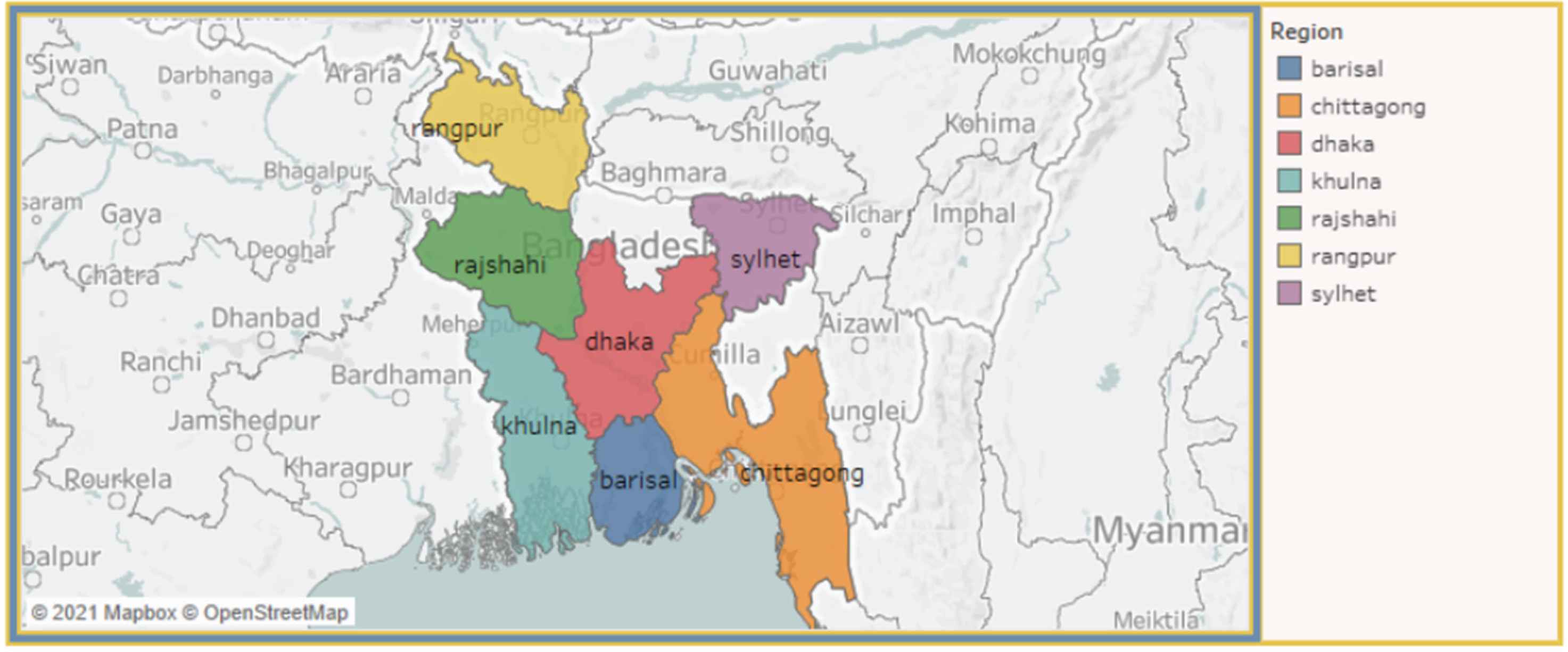
4.3. Mapping View
Figure 4 illustrates the mapping view of our visualization system. It represents a map of Bangladesh, where the regions are highlighted in different colors based on their respective numbers of diabetic patients. Using the drop-down menu for areas, residence, working status, and smoking status, we can visualize the number of patients on the map. This map is also click-activated; by clicking on a region, the total percentage of diabetes patients for that region can be observed.
4.4. Region View
Figure 5 shows the regional view of the system where the number of responses for each region is presented using a bar chart. This figure highlights a hover-activated bar chart map, where the bar plots change based on the hover data for respective regions, which also changes our mapping view. We can also use the other drop-down and range slider input, which features the attribute “age.” The fundamental of this view is a side-by-side comparison of the number of diabetes patients in every region. This aspect also provides perception as to how different regions have caused the production of diabetes patients.
4.5. Correlation Between SBP and DBP
In Figure 6, we provide the association between SBP and DBP. We also present a scatter-plot diagram to visualize the SBP and DBP of diabetes and control person. The user interaction in this view is click-data enabled. The hover information, including SBP, DBP and diabetes, are displayed on the graph. The scatter plot changes based on the input data for respective regions, residence, smoking status, working status, which visualize the cumulative and single incidents.
4.6. Correlation Between Height and Weight
Similar to the previously explained view, Figure 7 presented the correlation between height and weight. This view also confers a scatter-plot diagram that reflects the association between a person’s height and weight. This view is also click-activated. If we click on a point in the view, we can identify whether a person will have diabetes or not, based on the height and weight of that point. We can additionally notice the variations in the view by alternating the dropdown or slider inputs.
5. USER STUDY
We conveyed an experimental evaluation through a user study to investigate the performance of DiaVis. Our study aimed to explore the real users’ reaction to the system and their interaction with the dashboard by using multiple inputs and exhibited views which are illustrated in Figure 8. In our study, we engaged 20 participants, where ten were female and ten male participants. All of the participants were familiar with fundamental data visualizations previously. All participation was voluntary, and no payment was given to them for the study.
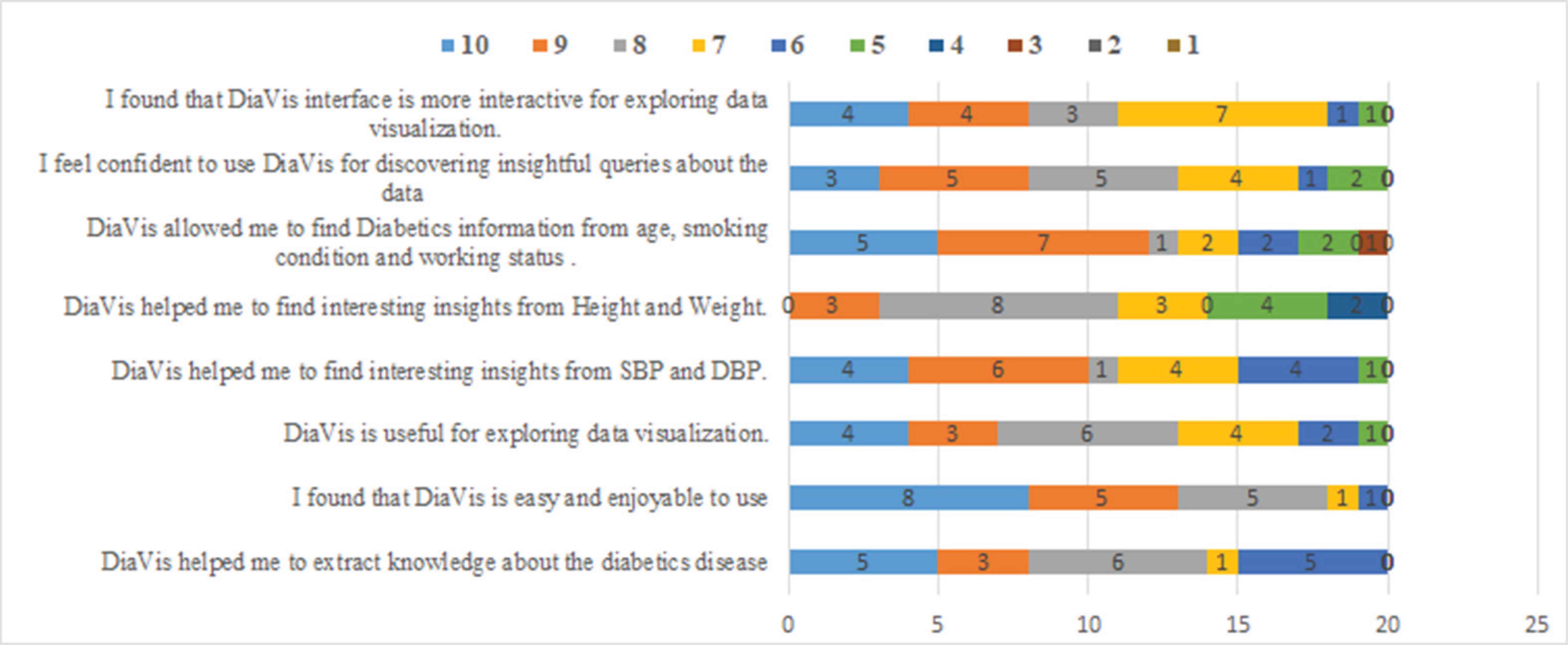
User study responses toward DiaVis.
After conveying the study, we have analyzed the results collected from the user feedback. The participants answered eight questions and scored them in the number range of 1 to 10. The scores provided by the participants are incorporated in a bar chart. From Figure 8, we can perceive that all scores are more than5 for each question. The majority of the participants scored the system between 8 to 10, this indicates DiaVis acceptance by the user. Additionally, DiaVis is compared with four different visualization dashboard such as ‘Diabetes Symptom’, ‘NIDDK’, ‘MXDiaControl’, and ‘Diabetes dashboard’ as shown in Table 3. While comparing DiaVis with these dashboards, it covers all the features and performs satisfactorily. Therefore, from this user study, we can state that our system performs adequately well and provides interesting insights for diabetes prediction.
| Features of dashboard | Diabetes symptom | NIDDK | MXDia Control | Diabetes dashboard | DiaVis |
|---|---|---|---|---|---|
| Free text search | × | × | × | × | ✓ |
| Multiple coordinated views | ✓ | ✓ | ✓ | ✓ | ✓ |
| Mapping view | × | × | ✓ | ✓ | ✓ |
| Region view | × | × | ✓ | × | ✓ |
| Correlation between SBP and DBP | ✓ | ✓ | ✓ | × | ✓ |
| Correlation between height and weight | × | × | × | × | ✓ |
Notes: (✓) indicates the presence of feature selections and (×) indicates that it does not visualize the feature outcome.
Performance comparison
6. DISCUSSION
Based on our experiments and evaluations, we derive several points that enhance the performance of diabetes detection using our visualization system. We asked 20 participants to rate our system based on eight questions. The majority of participants ascertained the system to be useful, easy, enjoyable to handle and manage. They also perceived exciting insights about different factors behind diabetes and extracted knowledge about the disease. We have used nine factors in our system to detect whether the patient has diabetes or not. Moreover, we generated a heatmap to discover the correlation between the factors that affect the patient’s insulin level and cause diabetes. From Figure 9, we can see that there is a strong correlation between systolic blood pressure and diastolic blood pressure which is 0.75. Moreover, there is an average correlation of 0.47 between height and weight.
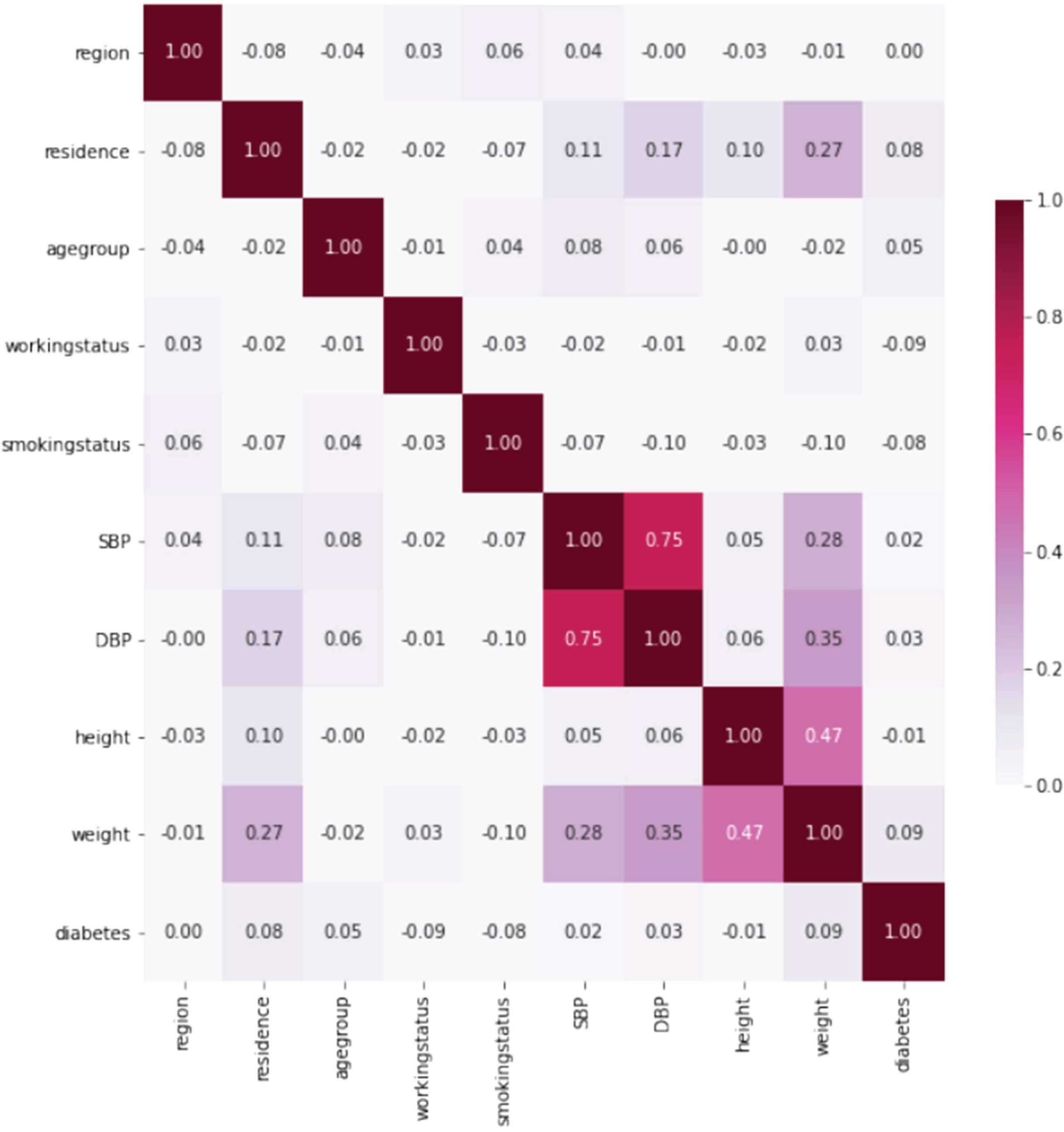
Similarity matrix of the attributes of DiaVis.
We deduce the following key insights:
- •
Age is a factor that interferes with the development of health needs during the life cycle. Among various significant parameters, the relationship between age and diabetes mellitus prevalence yielded inconclusive findings. Baquedano et al. [5], mentioned that older people have high diabetes risk. According to their findings, age is a critical component in providing diabetes education for disease management. Another factor to consider is the percentage of Mexicans who get type 2 diabetes before reaching 40. Diabetes was also found to be more likely as people got older, according to various research [9,16,22,24].
- •
DM is usually a hereditary disease. Obesity is one of the causatives and confounding factors that lead to the growth of diabetes mellitus. As a result, blood pressure is a very common complication of diabetes, affecting 20–60% of diabetic individuals, depending on weight, ethnicity, and age [2]. Additionally, diabetes-related comorbidities such as retinopathy and nephropathy are more frequent in hypertensive diabetic patients [3,4].
- •
- •
The high prevalence of diabetes among middle-class Bangladeshi people in both urban and rural areas could be due to various reasons. South Asians and Bangladeshis have a significant prevalence of lifestyle-related chronic illness risk factors. For example, 43% of Bangladeshi participants in the INTERHEART study exhibited centripetal obesity [32]. In Dhaka, 58% had centripetal obesity, and 63% had a BMI of overweight or obese; the prevalence was exceptionally high among women (82% and 77%, respectively). In addition, 58% of men had smoked cigarettes in the past, and 34% were actively smoking [39].
- •
The correlations we discovered between diabetes, age, and body weight are identical worldwide. However, according to various research, those with hypertension have a higher risk of diabetes. Diabetes and high blood pressure complement one other since they have physical traits [2]. Diabetic patients have higher systemic blood pressure due to more excellent peripheral arterial resistance.
Our results also show a relationship between multiple risk factors and considered three hypotheses. Another important finding of this study is the association between relevant cognitive functions in Bangladesh. Previous studies in developed countries have shown a strong relationship between poorly controlled diabetes and significant cognitive factors. However, no such research has been carried out in developing countries. Thus, our research study aids in the identification of the relationship between various factors and flourish how this relationship explores the analysis of diabetes diseases.
7. CONCLUSION
Diabetes has become a primary public concern across the world due to its pandemic nature. Bangladesh is not an exception. This study presented a new visualization system demonstrating the socio-demographic determinants that condition the prevalence of diabetes mellitus among individuals in Bangladesh. Age, gender, smoking status, job status, height, weight, hypertension, and degree of physical activity were all found to be significant predictors of diabetes mellitus prevalence among Bangladeshi people. This study suggests that the government and other interested parties pay more attention to developing appropriate policy initiatives for reducing the prevalence of diabetes and its related risks.
In our future study, we intend to include more input data to present various variables for investigating information visualization and NLP-based approaches to enlighten our free text searching modality. Moreover, we want to assess our system using real-world user case studies to determine the dashboard’s potential use with several coordinated views.
CONFLICTS OF INTEREST
The authors declare they have no conflicts of interest.
AUTHORS’ CONTRIBUTION
All authors are equally contributed to write, edit and revise the manuscript.
REFERENCES
Cite this article
TY  - JOUR
AU  - Mosiur Rahman
AU  - Md Rafiqul Islam
AU  - Sharmin Akter
AU  - Shanjita Akter
AU  - Linta Islam
AU  - Guandong Xu
PY  - 2021
DA  - 2021/11/27
TI  - DiaVis: Exploration and Analysis of Diabetes through Visual Interactive System
JO  - Human-Centric Intelligent Systems
SP  - 75
EP  - 85
VL  - 1
IS  - 3-4
SN  - 2667-1336
UR  - https://doi.org/10.2991/hcis.k.211025.001
DO  - 10.2991/hcis.k.211025.001
ID  - Rahman2021
ER  -